

Most eyecare websites fail where it matters most.
They don’t sell the part of the practice patients actually care about. Optical is buried, the team is invisible, and the pages meant to sell frames feel more like homework than fashion.
If optical is buried, patients assume it doesn’t matter.
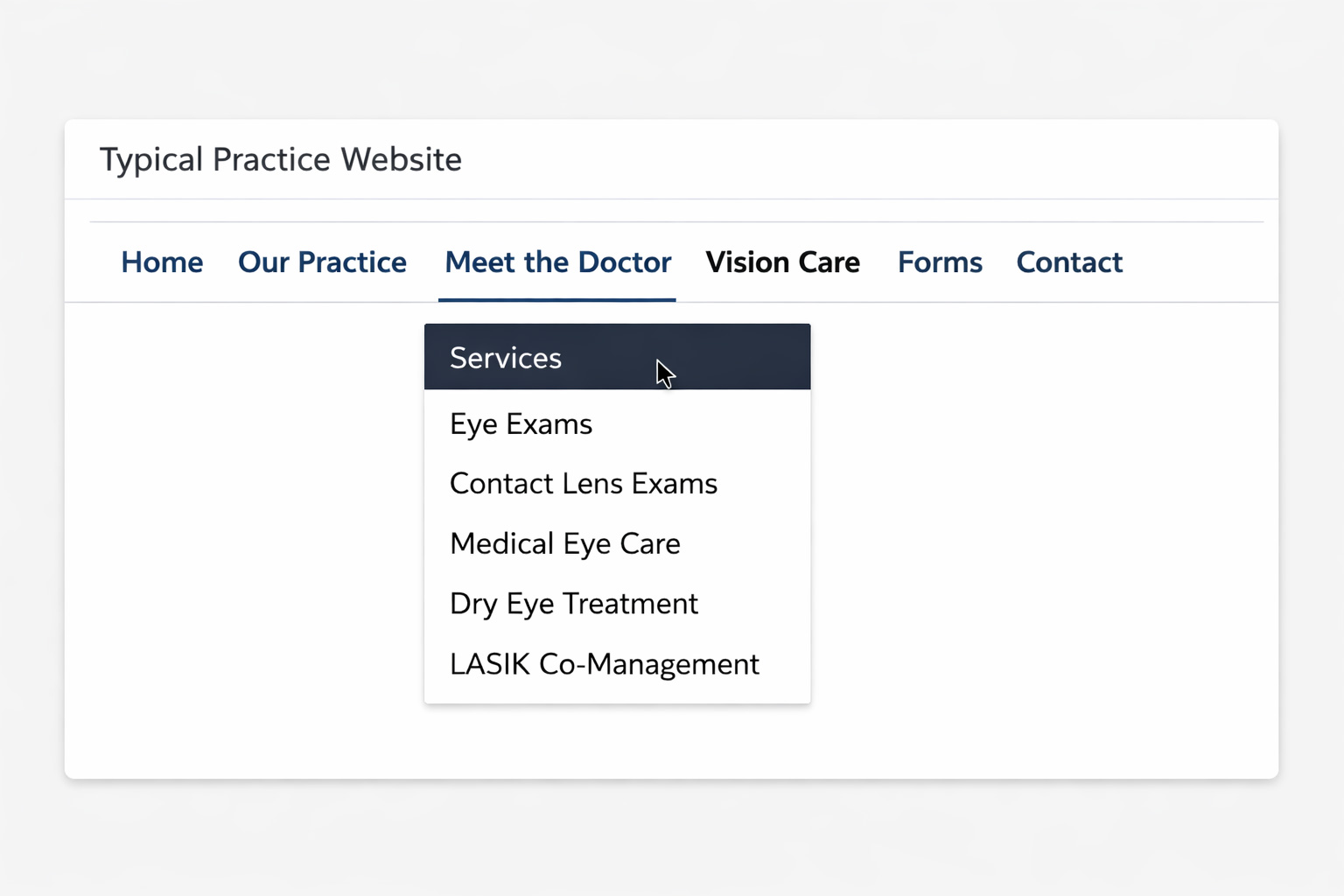
Many eyecare websites hide optical in a dropdown—or leave it out entirely. That tells patients exactly what you didn’t mean to tell them: eyewear is not a priority here.
What patients actually see
Optical looks hidden, secondary, and easy to ignore.
- Buried under Services or About
- Missing from primary navigation
- No signal that style or product matters
What patients should see
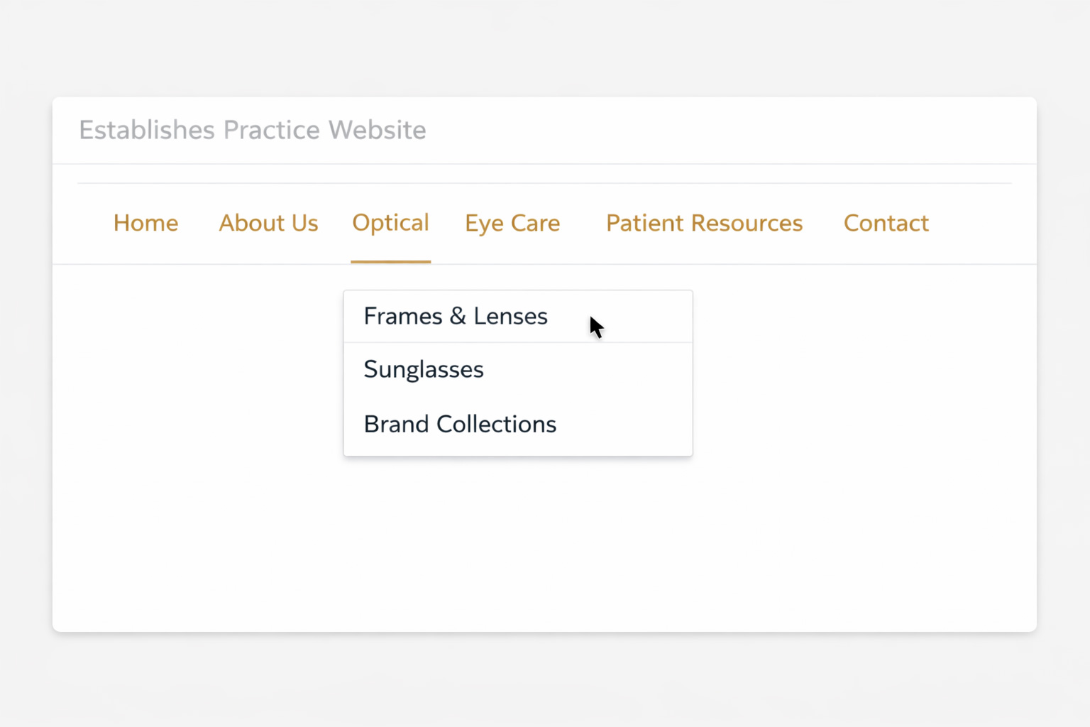
Optical should be visible immediately—because patients care about what they are going to wear.
- Optical featured in the main menu
- Frames and style surfaced early
- The site reflects both care and retail
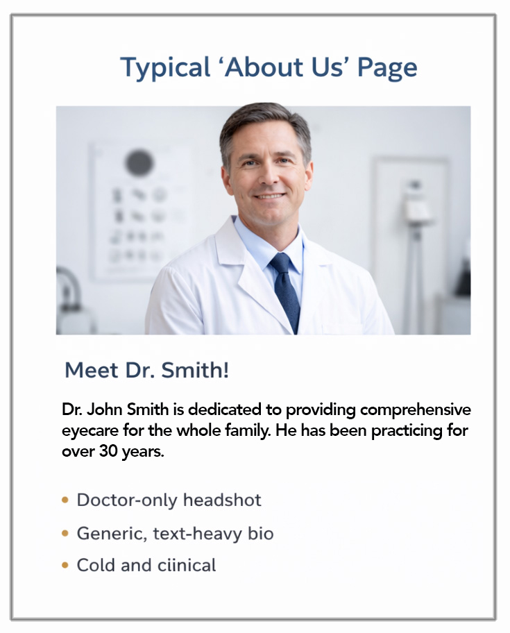
Most About pages showcase the wrong people.
Too many sites show only the doctor. But patients spend more time with your front desk, pre-test staff, and opticians than they do in the exam room. Leave them out, and you leave out the people who shape the real experience.
What patients actually see
One headshot. One title. Almost no sense of the team they will actually meet.
- Doctor-only headshot
- Generic, text-heavy bio
- No visibility into the real team
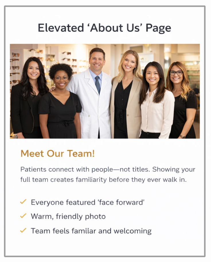
What builds trust instantly
Patients connect with people—not titles. Showing your full team creates familiarity before they ever walk in.
- Everyone featured, not just the doctor
- Warm, approachable team presence
- Reflects the real patient experience
You’re selling logos instead of eyewear.
This is where most optical pages collapse. Logo grids. Long text. Face-shape advice. Materials talk. No frames. No styling. No desire. Imagine Nordstrom showing brand names instead of products. That’s what many optical pages look like.
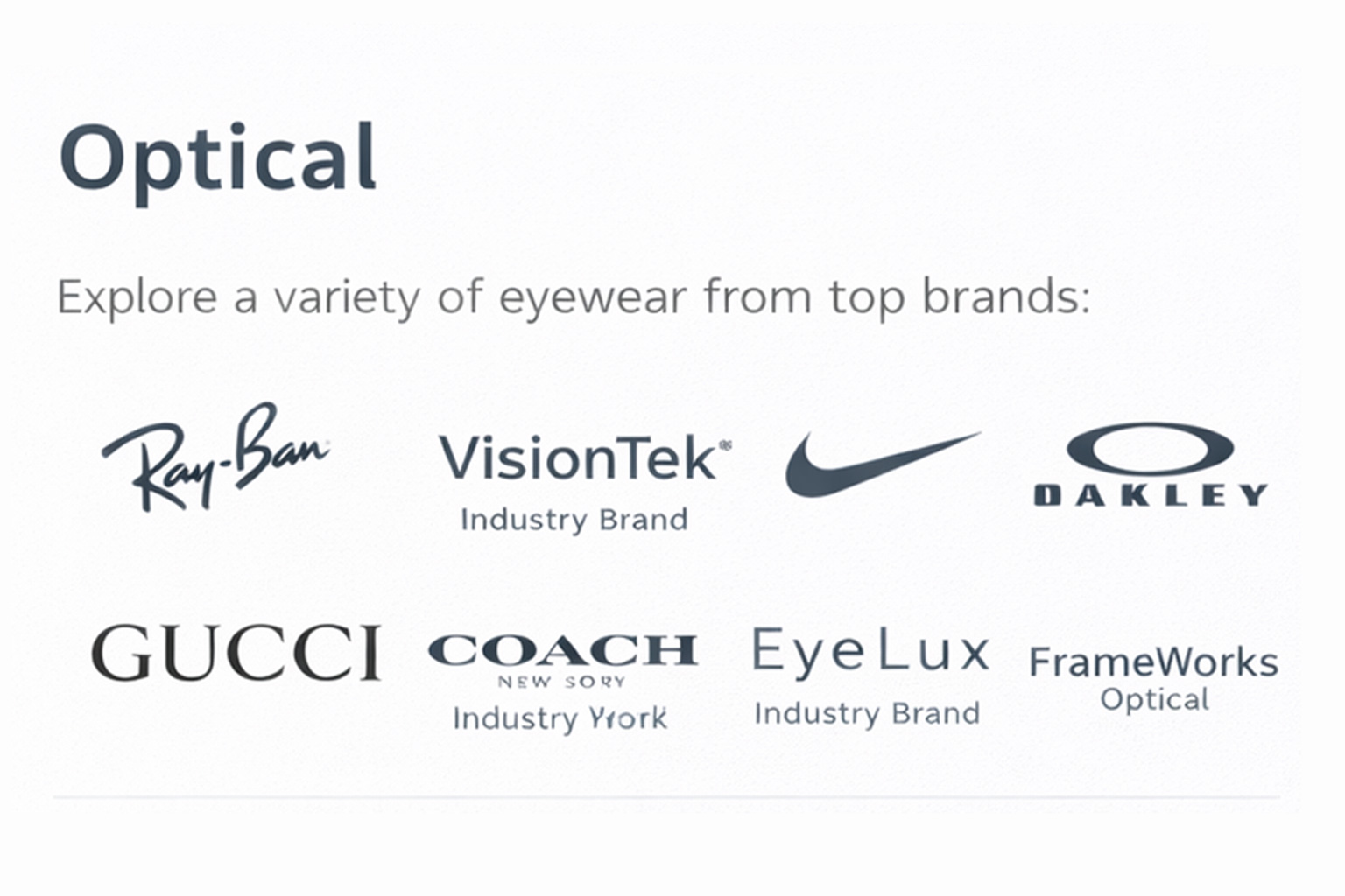
What patients actually see
- Brand logos—some familiar, most not
- No actual frame imagery
- Generic text patients won’t read
- No reason to feel or desire anything
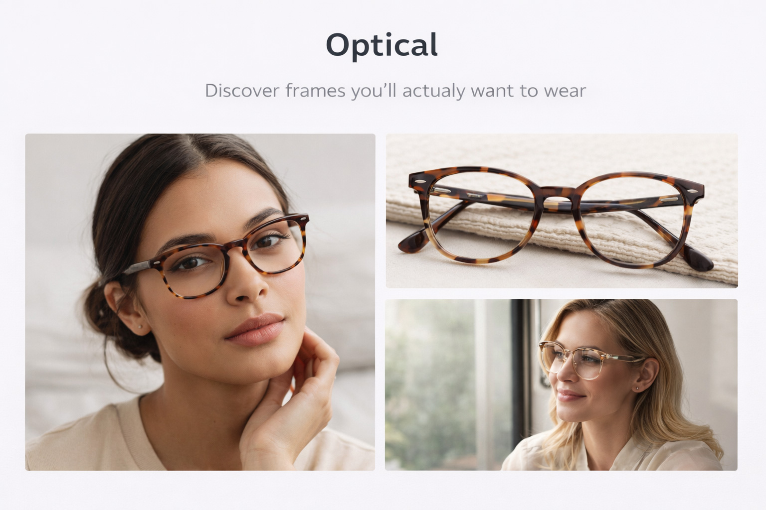
What patients respond to
Patients don’t connect with logos. They connect with how something looks—and how it makes them feel.
- Real frames, not just brand names
- Faces wearing them
- Clean, modern presentation
- Creates desire before the appointment
Patients don’t want to know how frames are made. They want to see how they look wearing them.
The problem is not a lack of information. The problem is that most practices are showing the wrong information in the wrong way. Patients scan quickly, react visually, and decide based on desire, trust, and perception.
You’re showing the process. Patients are looking for the outcome.
If your optical pages are weak, hidden, generic, or uninspiring, they won’t trigger a schedule-an-appointment mindset—and they certainly won’t trigger a purchasing mindset. A stronger website doesn’t just explain your practice. It sells the experience patients want to have.
Ditch your weaker site